Japanese symbolism and contemporary luxury
- Client
- Chichibu Saké
- Year
- 2026
- Industry
- Food & Beverage
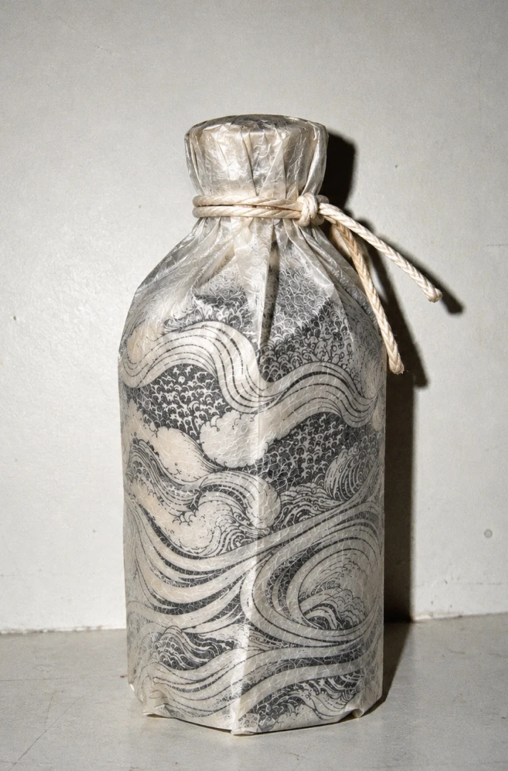
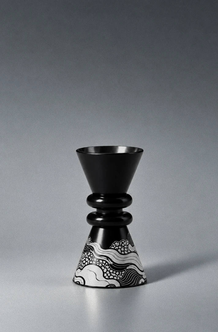
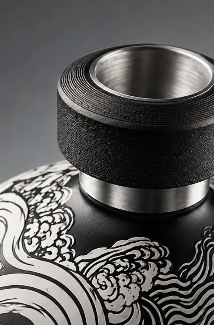
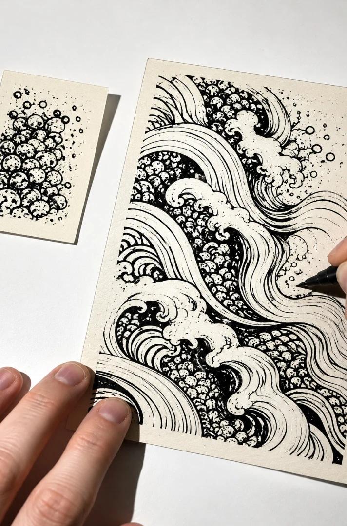
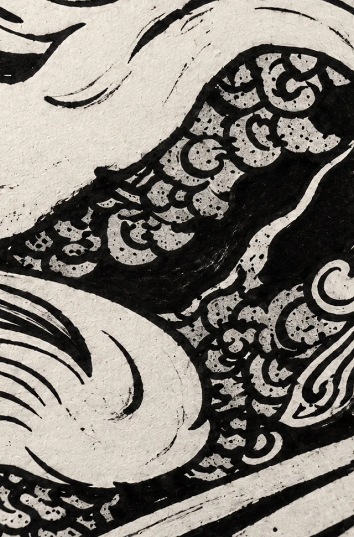
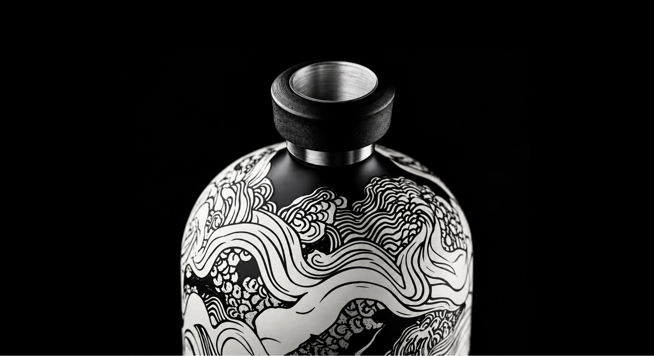
Rooted in Japanese iconography, the identity draws on the dragon, flowing water and the ritual of sake. Traditional motifs are reinterpreted through graphic illustration, monochromatic contrasts and tactile materials, bringing together the precision of Japanese craftsmanship and a contemporary visual sensibility.
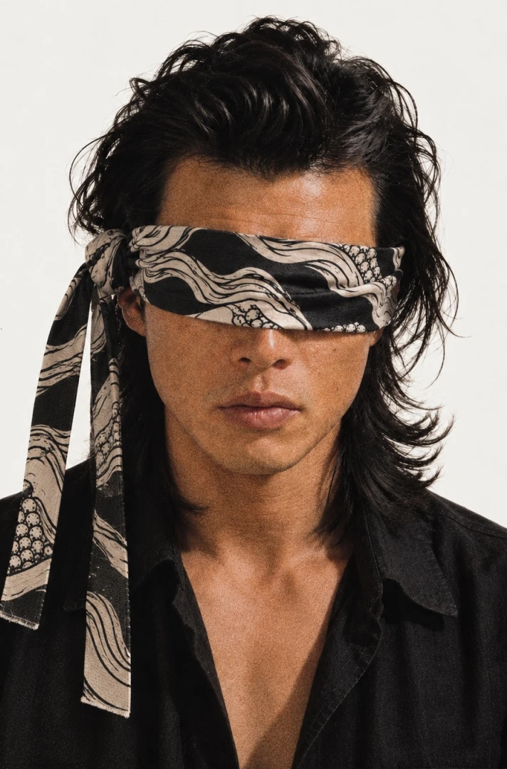
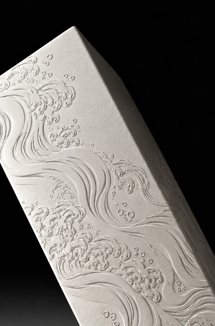
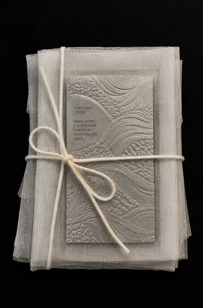
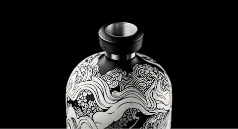
At the centre of the identity, an intricate dragon moves through waves and swirling currents, its form extending across the bottle, packaging and printed matter. Hand-drawn illustrations introduce movement and detail, contrasted with restrained typography, sculptural silhouettes and a palette of black, ivory and silver. Embossed surfaces, textured papers and carefully considered finishes give the identity a physical presence, inviting the object to be explored as much through touch as through sight.
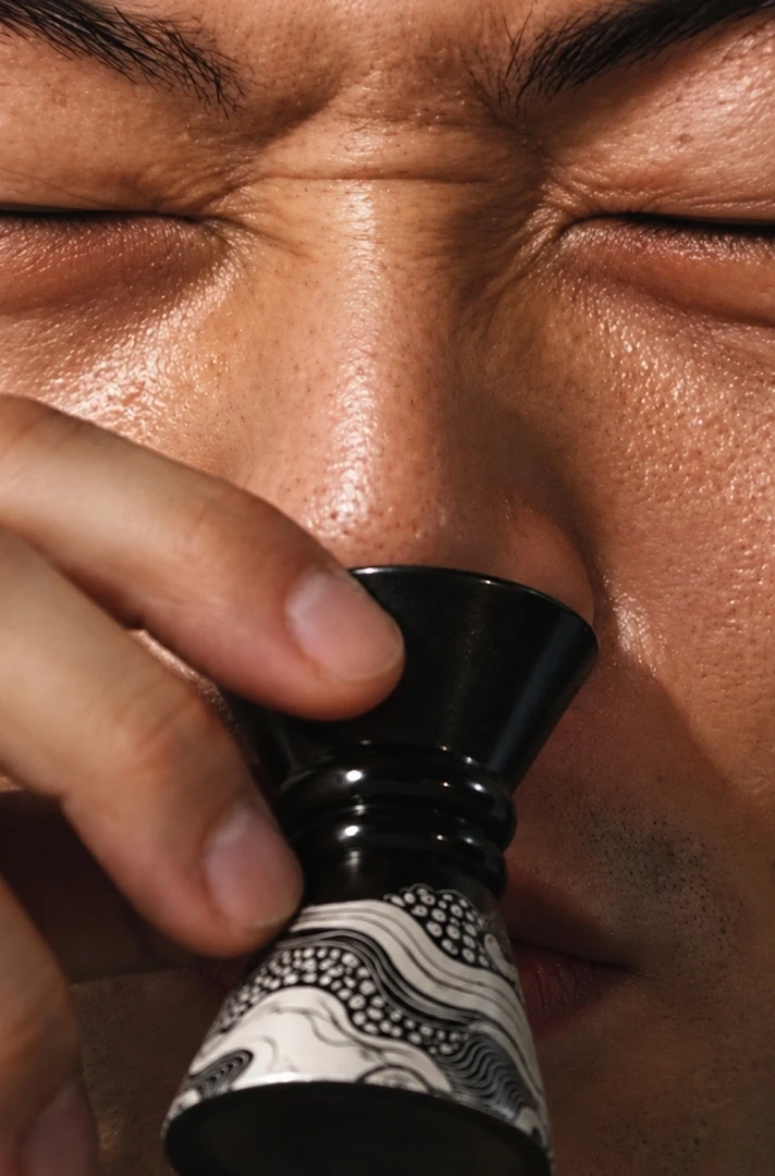
The visual language extends beyond the bottle into the wider tasting experience, creating a cohesive world around the product. From the presentation of the packaging to the imagery and supporting materials, each touchpoint builds on the same interplay between symbolism, materiality and restraint. Ancient references meet contemporary luxury without losing the character of either, turning a familiar ritual into something more deliberate, tactile and memorable.